
All this takes longer to type and post than to do...
Next - shading. I'll leave the dog and butterfly for last, because I need to use the main figure as the touchstone - everything must work with her colors when she's finished, including the eventual forest background
ЛщУРХвР©»ЁБЛұИ»ӯёьіӨөДКұјдАҙҙтЧЦәНХіМщ……
ПВТ»ІҪ——ТхУ°ЎЈОТҪ«°С№·әНәыөы·ЕФЪЧоәуЈ¬ТтОӘОТРиТӘК№УГЦчҪЗЧчОӘұкЧј——НкіЙөДКұәтЛщУР¶«ОчұШРлЕдәПЛэөДЙ«ІКЈ¬°ьАЁЧоәуөДҙФБЦұіҫ°ЎЈ
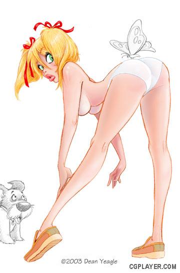
Rendered version, no skirt yet. First I render the whole figure; then, when I do the skirt on another level, I can adjust the transparency.
дЦИҫ№эөД°жұҫЈ¬»№Г»УРИ№ЧУЎЈКЧПИОТёшХыёцНј°ёЧЕЙ«Ј¬Ц®әуөұОТФЪБнТ»ІгЙПГи»жИ№ЧУөДКұәтОТҫНҝЙТФөчХыНёГч¶ИЎЈ
НјЖ¬К®Јә
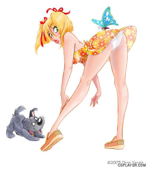
This step has taken a lot of small steps, but if I'd posted them all, the differences would not be that great; better, I thought, to show the major difference, and then explain. So here goes. I do the rendering by using levels first, and flattening as I go along. I will choose a reddish brown again, and lay down a flat color in what I will want to be a shaded area, and then use the Gaussian Blur on it...this takes a little experimentation, and I change the setting depending on the amount of blur I want. Then it's just a matter of doing that over and over, flattening when I'm sure I want what I've done, and adding different colors - red, blue, purple, brown, black, to the skin for various shadows or tones, and white for highlights.
ХвТ»ІҪ°ьАЁәЬ¶аРЎІҪЦиЈ¬ө«Из№ыОТМщіцАҙЛщУРөДІҪЦиЈ¬ЗшұрҪ«І»»бәЬГчПФЎЈЛщТФОТПл»№КЗ°СЦчТӘөДЗшұрХ№КҫіцАҙұИҪПәГЈ¬И»әуҪвКНЎЈОТТІҫНХвГҙЧцБЛЎЈОТЧЕЙ«КЧПИК№УГІгЈ¬И»әуИз№ыЧФјәҫхөГҝЙТФБЛЈ¬ҫНЖҙәПНјІгЎЈОТ»№»бФЩСЎФсТ»ёц·әәмөДЧШЙ«Ј¬И»әуНҝЙПөҘЙ«өчСХЙ«ФЪОТИПОӘУҰёГУРТхУ°өДөШ·ҪЈ¬И»әу¶ФТхУ°УҰУГёЯЛ№ДЈәэ……ХвёцРиТӘТ»Р©КөСйЈ¬ОТёщҫЭОТПлТӘөДДЈәэЦөёДұдЙиЦГЈ¬ПВГжҫНКЗЦШёҙХвЦЦІҪЦиЎЈөұОТИ·¶ЁОТёгәГБЛЈ¬ҫНЖҙәПЈ¬И»әујУИлТ»Р©І»Н¬өДСХЙ«Ј¬әмЎўА¶ЎўЧПЎўЧШЎўәЪЈ¬ёшЖӨ·фІ»Н¬өДТхУ°әНЙ«өчЈ¬°ЧЙ«ёшёЯ№вЎЈ
I usually put a white line around the edges of the figure - a broken line, of varied widths, sometimes disappearing in the darkest shadows - but I find that makes the figure pop and acts as an indication of backlight. The line is WITHIN the outline of the figure.
ОТНЁіЈ·ЕТ»Р©°ЧПЯМхО§ИЖНјРОұЯФө——Т»ёц¶ПҝӘөДУРІ»Н¬ҝн¶ИөДПЯМхЈ¬НЁіЈ»бФЪЧо°өөДТхУ°ҙҰПыК§——ө«КЗОТ·ўПЦДЗК№Нј°ёН»іц¶шЗТұнПЦОӘұі№вәЫјЈЎЈХвёцПЯМхЗ¶ФЪҪЗЙ«өДВЦАӘЦРЎЈ
When the figure is rendered as I wish, I try one more effect - I make a copy of the figure level, choose the white BG area and delete it (and in this case, the butterfly and dog, too), and then do Image>Brightness/Contrast and darken it considerably. Doesn't matter how much, really, just so it's dark enough; I'll lighten it by taking down the opacity of that level when I'm done. Then I take a large, blurred edge brush on eraser setting, set to perhaps 50%, and take out areas on this darkened level that I want to appear as light. It's like painting with light. I'll bump up to 100% eraser for the lightest edges, and I usually make the eyes as bright as possible, even if the face is in shadow. Then I'll adjust the opacity of the level and that's where I am at this point.
өұНјРО°ҙХХОТЖЪНыөДЧЕЙ«әуЈ¬ОТіўКФБнТ»ёцР§№ыЈ¬ОТЧцБЛТ»ёцНјІгҝҪұҙЈ¬СЎФс°ЧЙ«ұіҫ°ЗшЈ¬И»әуЙҫіэЈЁФЪХвёцАэЧУЦР°ьАЁәыөыәН№·Ј©Ј¬ФЩХвСщЧчЈәImage > Brightness/ContrastЈ¬ЧцҪП¶аөД°ө»ҜЈ¬ХжөДІ»УГөЈРД¶аЙЩЈ¬Чг№»°өЈ»ОТЧцНкә󣬻бНЁ№эҪөөНДЗІгөДІ»НёГч¶ИАҙјУББЛьЎЈПВГжЈ¬ОТФЪІБіэЙиЦГЦРСЎТ»ёцҙуөДЈ¬ұЯФөДЈәэөДЛўЧУЈ¬ЙиЦГөҪ50%Ј¬ИҘҙҰөфФЪХвёц°ө»ҜөДНјІгЦРОТЖЪНыұнПЦОӘББөДЗшУтЎЈҫНәГПлК№УГ№вББНҝДЁЎЈОТҪ«ОӘЧоББөДұЯФөЈ¬УГТ»ПВЧУМбёЯөҪ100%өДІБіэ№ӨҫЯЈ¬ОТНЁіЈИГСЫҫҰІҝ·ЦҫЎҝЙДЬГчББЎЈОТ»№Ҫ«өчХыПЦФЪОТҙҰАнөДІгөДІ»НёГч¶ИЎЈ
Not sure about the color of this sundress, actually, but here it is.
ЖдКөІ»М«И·¶ЁХвПДЧ°өДСХЙ«Ј¬І»№эЛьҫНФЪХвАпБЛЎЈ
НјЖ¬К®Т»Јә
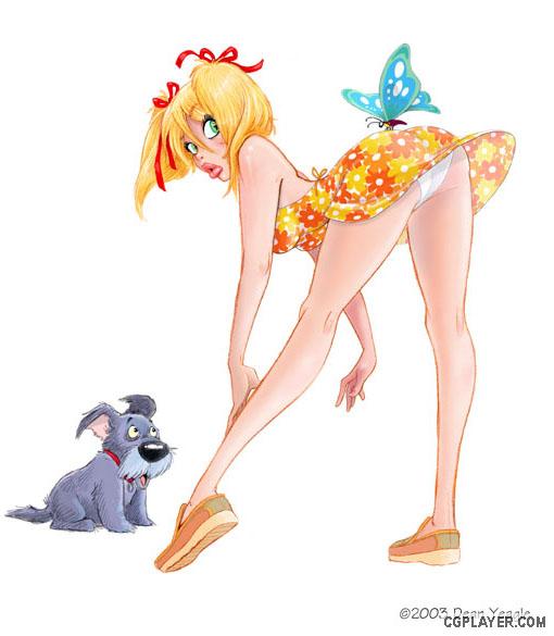
Okay, here's what I think is the final version before the background. New, more energetic and less Jockian pup, slight changes here and there, and a more energetic breeze as well.
әГБЛЈ¬ХвҫНКЗОТИПОӘКЗЧоЦХ°жұҫБЛЈ¬іэБЛұіҫ°ЎЈУРР©РВөДРЎұд»ҜЈ¬»№УРёьЙъ¶ҜөДОў·зЎЈ
This is going to be made into a 3D print...I've been contacted by a gentleman in Oregon who has clued me into the amazing world of 3D. Not the simple 'anaglyph' (red/blue) ones I did and sold at the SD Con, but serious ones, made with great care and detail, and visible in two ways - one by crossing your eyes in the manner of those Magic Eye things which infested the Malls of America for a while a few years ago, but with single images instead of amazing and dopey shapes appearing out of unrelated pictures, and the other printed on cards and seen with viewers of the same sort as the old-time stereopican slides. He's done a few versions for me, including the Mandy with flower, and the effect is just terrific.
ХвҪ«»бЦЖЧчіЙ3DУЎЛў……ОТБӘПөБЛТ»О»OregonөДЙрКҝЈ¬ЛыТэөјОТҪшИлЙсЖжөДИэО¬КАҪзЎЈІ»КЗОТЧц№эөДјтөҘөДёЎөсЈЁәм/А¶Ј©ФЪSDҪЗВфөДДЗЦЦЈ¬¶шКЗТ»ёцСПЛаөДЈ¬ПёРДөДідВъПёҪЪөДЦЖЧчЈ¬¶шЗТҝЙТФУРБҪЦЦ·Ҫ·Ёҝҙ——Т»ёцКЗҪ»ІжЛ«СЫКУПЯөД·Ҫ·ЁЈ¬ҫНПсКЗјёДкЗ°·зРРГА№ъЙМіЎөДД§КхСЫТ»СщЎЈө«КЗКЗјтөҘөДНјПсЈ¬¶шІ»КЗТ»ёұНјПсҙУБнТ»·щІ»ПаёЙөДёЎПЦіцАҙЎЈБнТ»ёц·Ҫ·ЁКЗУЎЛўФЪҝЁЖ¬ЙПҫНПсАПКҪБўМе»ГөЖҝЁЖ¬ДЗЦЦАаРНЎЈЛыОӘОТЧцБЛТ»Р©°жұҫЈ¬°ьАЁMandy with FlowerЈ¬Р§№ыХжКЗМ«°фБЛЎЈ
НјЖ¬К®¶юЈә