

НЬГЬ]Making of “Set out for Lover”
Making of “Set out for Lover”
by T.G.Jay
Email: tinyglobe@hotmail.com
Homepage: www.tgjay.com
ЪмбћаДЕФНЬГЬЃЌEЮФВЛКУЃЌЛЙЧыДѓМвДеКЯЁЃ
ЯШгаЕФEЮФЃЌЮЊЪЙвтЫМУЛгаЫ№ЪЇЃЌБЃСєдЮФЁЃ
Introduction(МђНщ):
In the deep forest, there are some tree guys. They live happily, but some of them are interested in the world outside. So is Melody who is Jay’s Lover. She left for the mysterious world and told Jay that she would come back when sun shone in the dark forest. Several years later, sunshine lightened the whole forest. Jay set out to prepare a big surprise for Melody even if he didn’t know whether She would come back……
дкУЏУмЕФЩСжРяЃЌзЁзХвЛШКЪїЦмШЫЁЃЫћУЧАВРжЕиЩњЛюзХЃЌЕЋЪЧЫћУЧЖдЭтУцЕФЪРНчвЛЮоЫљжЊЃЌГфТњКУЦцЁЃJayЕФСЕШЫMelodyОЭЖдЭтУцЕФЪРНчЪЎЗжИааЫШЄЁЃзюжеЃЌЫ§ОіЖЈГіШЅПДПДЁЃЫ§ ИцЫпJayЃЌЕБбєЙтдйДЮВМТњЩСжЕФЪБКђЃЌЫ§ЛсЛиЕНЫћЩэБпЁЃМИФъЙ§ШЅСЫЃЌбєЙтЕФШЗдйДЮОьЙЫЩСжЁЃJayжЊЕРMelodyОЭвЊЛиРДСЫЃЌЫћДђЫуИјMelodyвЛИіЪЎзуЕФОЊЯВЃЌЕЋЪЧMelodyФмВЛФмГіЯжШдШЛЪЧвЛИіЮДжЊЪ§……
Yes, it’s my new story about tree guys. They are hairy and shaggy. The story will become a CG Short later. I’m now doing the concept of the story. “Set out for Lover” describes the scenario, which Jay is setting out for his lover. It’s the first scene design of “Tree guys”. I think it will affect the entire visual effects. So I painted many necessary details which seems to be over painted now.
ВЛДэЃЌетЪЧЮвЕФаТЙЪЪТЃЌЫќНВЪіСЫГЄУЋєТЩэЕФЪїЦмШЫЕФЙЪЪТЁЃвВаэЃЌетИіЙЪЪТВЛОУКѓОЭФмГЩЮЊвЛВПCGЖЬЦЊЁЃЮве§дкЮЊЖЬЦЊзіИХФюЩшМЦЁЃ“Set out for Lover”УшЪіСЫЙЪЪТГЁОАжЎвЛЁЃФуПЩвдПДЕНЃЌJayе§ЖЏЩэЭтГіЁЃе§ЪЧвђЮЊетЪЧЮвЮЊЮвЕФаТЙЪЪТзіЕФЕквЛеХИХФюЩшМЦЃЌЫљвдЮвдкЩшМЦИхжаМгзуСЫЯИНкЃЌетаЉЯИНкдкЯждкПДРДЪЧВЛБивЊЕФЃЌЕЋЫќжеНЋГЩЮЊећИіЖЬЦЌЛУцжЪСПЕФвЛИіБъИЫЁЃ
In this tutorial, I will show you some skills to accomplish the work. I haven’t any art background before and totally self-tought. Two years age I picked up Maya. One year age I was involved in painting. So you don’t mind if you are a hobbyist. You can have a command of these skills easily. Nevertheless, it’s worthy to mention that 3D skills help me a lot. I’m working at shading and rendering. It’s another efficient way for me to understand lights in the world. Everyone could learn from 3D applications for consideration.
етРяЃЌЮЊДѓМвЯзЩЯвЛЦЊНЬГЬЁЃЮвНЋЮЊДѓМвНВЪіШчКЮЭъГЩетеХзїЦЗЁЃЮвУЛгавеЪѕБГОАЃЌдјОЖШЙ§СЫСНФъМшПрЕФздбЇРњГЬЃЌЫљвдШчЙћФуЪЧвЛЮЛИеНгДЅCGвеЪѕЕФШЫЃЌвВееОЩФмУїАзЮвЮФеТЕФФкШнЃЌЫќУЧЖМЪЧКмЭЈЫзЕФЁЃШЛЖјВЛЕУВЛЬсЕФЪЧЃЌ3DСьгђЕФжЊЪЖЮЊЮвЕФЛцЛЬсЙЉСЫгавтЕФРЉГфЃЌ3DЕФжЊЪЖШУЮвЖдЙтЯпгаСЫИќЩюШыЕФСЫНтЃЌгЕга3DжЊЪЖЪЧвЛИіКмКУЕФЦ№ЕуЁЃ
[ БОЬћзюКѓгЩ tinyglobe гк 2006-10-10 00:14 БрМ ]  ЭМЦЌИНМў: orig554.jpg (2006-9-19 22:40, 144.96 K)
Skill 1: Story makes work attractive.
ММЧЩвЛЃК“ОпгаЙЪЪТадЕФЛУцИќЮќв§ШЫ”
Someone told me that he saw something to happen in the frame. He could imagine the story outside the frame though his one is different from mine. “Set out for lover” owns its background story. I designed the expression and action for this tree guy, the plant and hanging bridge for the scene. When the viewers are told the tree guy story, they may look for some details in the work again. That’s exciting.
гаШЫИцЫпЃЌЫћПДЕНЛУцРяУце§дкЗЂЩњЕФЃЌЩѕжССЊЯыЕНСЫЛУцЭтЕФЖЋЮїЃЌОЁЙмЮвжЊЕРЫћЕФСЊЯыКЭЮвЕФЩшЯыПЯЖЈДѓЯрОЖЭЅЁЃ“Set out for lover”газдМКЕФЙЪЪТБГОАЃЌМИКѕЫљгаЕФЖЋЮїЖМЪЧБЛЩшМЦЙ§ЕФЃЌАќРЈЛУцжаНЧЩЋЕФБэЧщКЭГЁОАЕРОпЕШЁЃвВаэЙлжкБЛИцжЎЦфжаЕФВЪЕАКѓЃЌЛсШФгааЫШЄЕидйзСФЅЦфжаЕФЯИНкЁЃетвВЪЧШУзїепИаЕНаЫЗмЕФЁЃ ЭМЦЌИНМў: prtsrc1.jpg (2006-9-19 22:41, 233.25 K)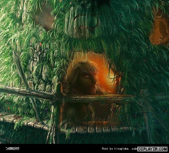
Skill 2: The atmosphere is visible.
ММЧЩЖўЃКШУПеЦјЯдаЮ
Atmosphere makes your work more 3d-looks. You can feel the distance between two object in the scene. There are 3 ways to get the effects:
Firstly, the near object looks saturated and strongly contrastive while the far object looks desaturated and weakly contrastive.
ЛЗОГвдМАДѓЦјаЇЙћФмШУФуЕФЛУцИќгаВуДЮЁЃФуФмЧсЫЩИаЕНЮяЬхМфЕФОрРыЁЃгаШ§ИіЗНЗЈПЩвдШУПеЦјЯдаЮЃК
ЕквЛЃЌШУНќДІЕФЮяЬхЯдЯжИќИпЕФЩЋВЪЖдБШКЭЩЋВЪБЅКЭЁЃдЖДІдђЗДжЎЁЃ
Secondly, cold color looks further while warm color looks nearer.
ЕкЖўЃЌРфЩЋЯЕФмШУЛУцЭљРяЪеЃЌДгЖјЯдЯжДІзнЩэИаЁЃ
Last but not least, light fog can emphasize the object you want to describe more. It increase the contract of the entire image, catch up your eyeball easily. If you want, you can also add some dusts in the light fog.
ЕкШ§ЃЌЙтЮэФмАяФуЧПЕїЛУцжаЕФжиЕуЁЃЫќФмРДѓЛУцЕФЖдБШЃЌДгЖјзЅзЁблЧђЁЃЕБШЛЃЌдкРяУцМгЩЯвЛаЉЛвГОЛсгаИќКУЕФаЇЙћЁЃ ЭМЦЌИНМў: atmo1.jpg (2006-9-19 22:43, 66.24 K)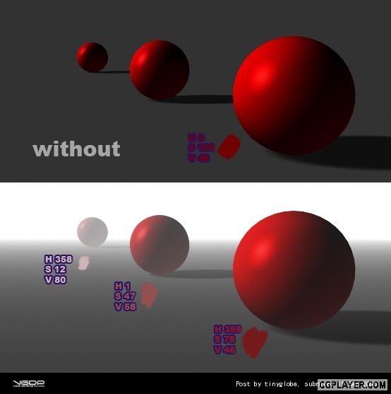 ЭМЦЌИНМў: atmo2.jpg (2006-9-19 22:43, 73.13 K)
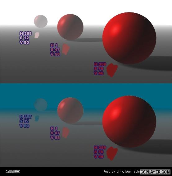 ЭМЦЌИНМў: atmo3.jpg (2006-9-19 22:43, 287.59 K)
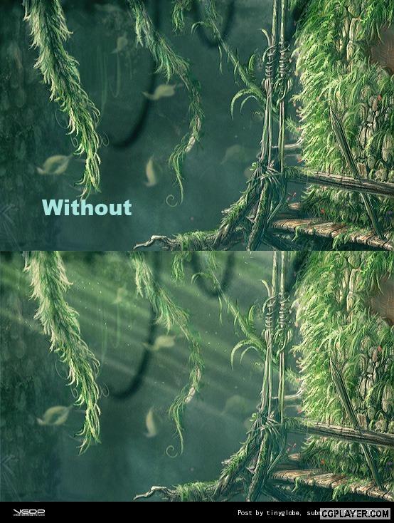
Skill 3: Color can help u travel further.
ММЧЩШ§ЃКЩЋВЪКмживЊ
It’s difficult to describe the color theory in such a short tutorial. But you can recognize the difference between the image with color and the one without color. Combination of warm and cold color makes the image alive. I recommend a tutorial written by Richard Yot (http://www.itchy-animation.co.uk/tutorials/light01.htm). It will tell you where warm and cold colors come from.
КмФбдкетбљЕФЦЊЗљРяУцВћЪіЧхГўЩЋВЪРэТлЁЃЕЋЪЧЩЋВЪЪЧШЫблИаЪмЕФЕквЛвЊЫиЃЌЦфДЮВХЪЧаЮзДКЭЮЦРэЁЃКмУїЯдШУЮяЬхгЕгабеЩЋФмЛёЕУИќКУЕФЪгОѕаЇЙћЁЃЯТУцЕФЕквЛеХЭМЪЧУЛгаЩЋВЪЃЌЕЅвЛЕФЕїзгВЛФмГЩЮЊЩЋВЪЁЃРфХЏЛвЕФНсКЯВХФмВњЩњСюШЫгфдУЕФЕїзгЁЃетРяЃЌЮвЭЦМівЛЦЌНЬГЬЃЌЫќЕФзїепЪЧRichard Yot (http://www.itchy-animation.co.uk/tutorials/light01.htm)ЁЃетЦЊНЬГЬНВЕНСЫИїжжРфХЏЙтЕФРДдДЁЃ ЭМЦЌИНМў: color1.jpg (2006-9-19 22:44, 427.13 K)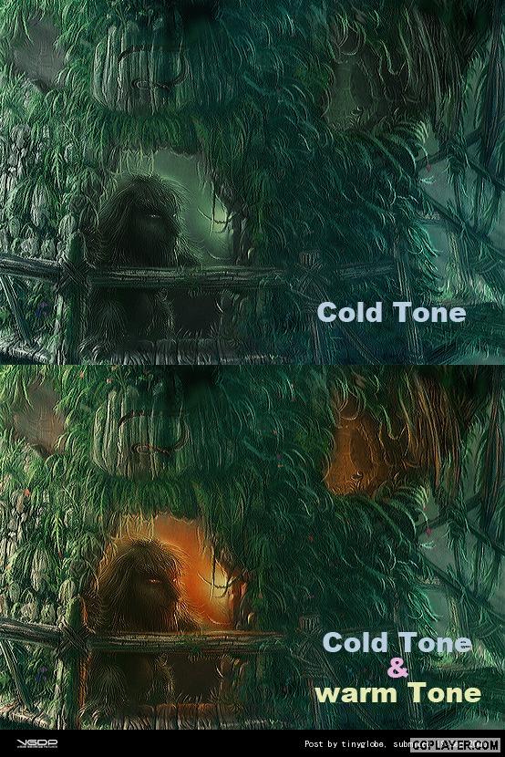
Skill 4: leaves.
ММЧЩЫФЃКЛвЖзг
Here I will show you two photos. The first one describes the back light effect of hundreds of leaves. The leaves on the edge are bright and saturated. The second one describes the different between the front side and the back side of the leaf. The front side appears darker with high reflectivity. The back side seems to be translucent. That’s all! Actually, we can paint leaves now. But before we starts, we’d better know something about shading.
ЛвЖзгЧАЃЌЮвУЧЯШПДЯТУцСНеХееЦЌЃЌЫќУЧБШНЯЫЕУїЮЪЬтЁЃЕквЛЪЧДѓСПвЖзгдкБГЙтЯТГЪЯжГіЕФаЇЙћЃЌБпдЕЕФвЖзгЪЧКмБЉЕФЃЌЩЋВЪДПЖШвВКмИпЁЃЕкЖўеХЪЧвЖзге§УцКЭБГУцЕФаЇЙћЁЃвЖзге§УцБэЯжГіИќЖрЕФЗДЙтЬиадЃЌЫќЕФБэУцКмАЕЃЌЕЋдкЬиЖЈНЧЖШгаЧПЗДЩфЁЃвЖзгБГУцБэЯжГіИќЖрЕФЭИЙтадЁЃгаСЫетаЉРэТлЃЌЛљБОЩЯОЭПЩвдЛвЖзгСЫЃЌЕЋдкПЊЪМжЎЧАЮвУЧЛЙвЊСЫНтвЛЯТвЖзгЕФshadingЁЃ ЭМЦЌИНМў: leaf1.jpg (2006-9-19 22:45, 186.53 K)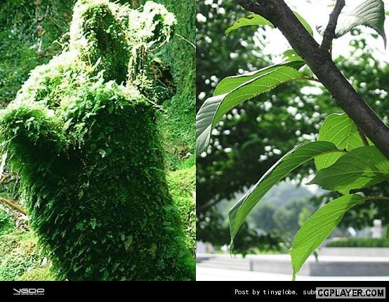
Shaders are used to determine the relationship of color and illumination. What is the relationship of translucent and color? It seems to be more saturated near the terminator when objects look translucent. And the front side and back side of leaves have different relationships. The picture below shows five shaders. The last one is the shader of leaf. You also can see the relationship of color and illumination.
ShaderУшЪіСЫЙтееКЭЩЋВЪЕФЙиЯЕЁЃЕБЮяЬхКмЭИЕФЪБКђ(КУБШвЖзг)ЃЌЫќЕФЩЋВЪЙиЯЕгжЪЧШчКЮЕФФиЃПДгЯТЭМПЩвдПДЕНЃЌКмЭИЕФЮяЬхдкУїАЕНЛНгЯпИННќЕФбеЩЋГЪЯжГіИќБЅКЭЕФЧїЪЦЁЃДгЭМжаЛЙПЩвдПДЕНЃЌвЖзге§ЁЂЗДУцЕФЩЋВЪЙиЯЕвВЪЧВЛЭЌЕФЁЃетаЉЙлВьЕФНсЙћЖдгкЛцЛЖМЪЧгаАяжњЕФЁЃ ЭМЦЌИНМў: leaf2.jpg (2006-9-19 22:46, 61.72 K)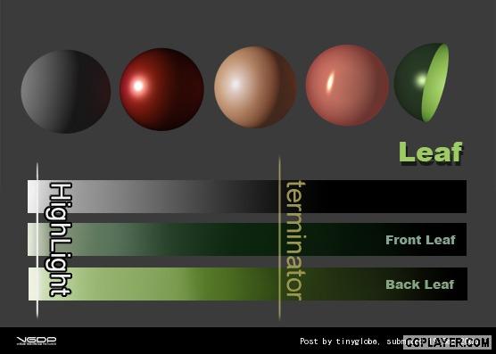
Then, let’s get started. It’s hard to get the final result by painting only one time. More times you paint, more levels you get. Finally, please don’t forget the backlight effects. You can see the photo above for consideration.
ЮвУЧжегкПЩвдЖЏБЪСЫЁЃвЊЯывЛПкЦјЛёЕУШУШЫЭИВЛЙ§ЦјРДЕФЯИНкЕБШЛЪЧКмРЇФбЕФЁЃЭПбЛЕФВуЪ§дНЖрЃЌВуДЮВХИќЗсИЛЁЃЫљвдЯИНквЊвЛБщвЛБщЕФЛВХФмИќКУЕиЬхЯжГіРДЃЌЕБШЛЛЙІКУЕФЛАЃЌетвВЪЧВЛБивЊЕФЁЃЛцжЦЙ§ГЬДѓжТШчЯТЃЌзюКѓВЛвЊЭќСЫФцЙтЕФаЇЙћЁЃ ЭМЦЌИНМў: leaf3.jpg (2006-9-19 22:47, 213.14 K)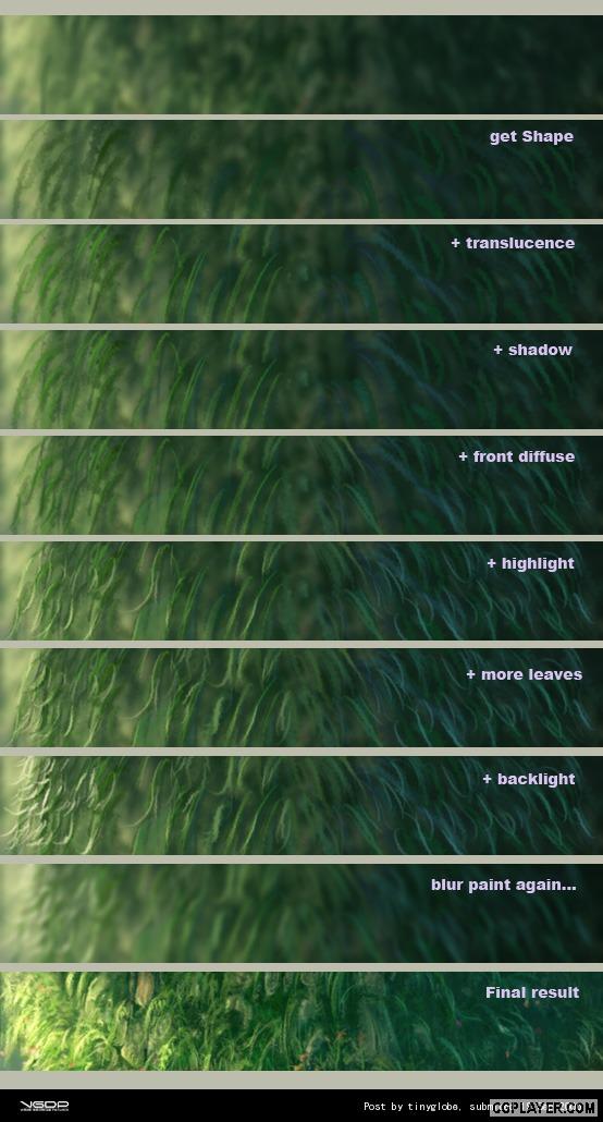
Skill 5: Add some flavorings.
ММЧЩЮхЃКЕїЮЖМС
When you finished your work, you can add some flavorings at last. They will give you more details and make your image real. I do sharpness, glow and lens blur. Maybe you have another choice.
ДѓЙІИцГЩЃЌзюКѓЛЙгавЛаЉАьЗЈПЩвдШУЛУцПДЩЯШЅгаИќЖрЕиЯИНкКЭИќКУЕФаЇЙћЁЃУПИіШЫЕФЗНЗЈЖМгаЫљВЛЭЌЃЌетРяЮвМгСЫШёЛЏЃЌЛдЙтКЭОАЩюаЇЙћЁЃ ЭМЦЌИНМў: flav1.jpg (2006-9-19 22:48, 206.92 K)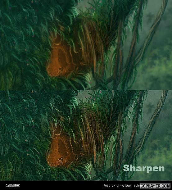 ЭМЦЌИНМў: flav2.jpg (2006-9-19 22:48, 358.81 K)
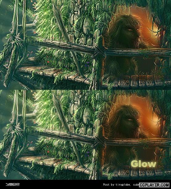 ЭМЦЌИНМў: flav3.jpg (2006-9-19 22:48, 61.08 K)
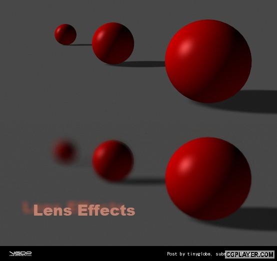
Skill 6: Keep patient.
ММЧЩСљЃКБЃГжФЭаФ
I kept up telling myself that I’m pursuing art, never give up until I feel satisfied during the period months. I’m convinced of the belief that constancy helps me do better. I think it will help you as well.
“ЛцЛФмЬевБадЧщ”етОфЛАвЛЕуВЛМйЃЌВЛЙмЦНЪБЯыЯѓСІЖрУДЗсИЛЃЌЙиМќЕФЪБКђПМбщЕФЛЙЪЧЯИНкЁЃФЭЕУзЁадзгАбЛЛЭъећПДЫЦЛЈСЫКмЖрЪБМфЃЌЕЋетбљЛЈЪБМфНјВНЕУИќПьЁЃ ЭМЦЌИНМў: patient1.jpg (2006-9-19 22:48, 246.96 K)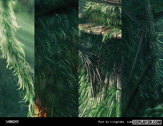
ConclusionЃЈзмНсЃЉ:
This isn’t a step-by-step tutorial. It doesn’t discuss the applications, either. But it’s a general brief of my work “Set out for Lover”. I’ve told you the most important skills I’ve applied. If you’re interested in how I use the software and tablet, you could send a email to me (tinyglobe@hotmail.com) or leave a message to me (tinyglobe.spaces.live.com). Any discussion and comment are welcome. That’s all. Hope you like it.
етЦЊНЬГЬВЂУЛгаНВШэМўЕФгІгУЃЌвВУЛОпЬхНщЩмШчКЮвЛЦЌвЛЦЌЛГіВнЃЌЕЋЪЧЮвЕФДДзїЯыЗЈвбОНщЩмЕУВюВЛЖрСЫЁЃИќЖрЕФММЪѕЯИНкКЭЯыЗЈПЩвдаДаХ(tinyglobe@hotmail.com)ИјЮвНЛСїЃЌЛђепжСblog (tinyglobe.spaces.live.com)СєбдЃЌЮввбОзЈУХПЊЯрЙиШежОЁЃзюКѓЃЌЯЃЭћДѓМвЯВЛЖетЦЊНЬГЬЁЃ
БГОАНЬГЬ
РДдДЃК
зїепЃК
ЪБМфЃК2008-09-08
ЕуЛїЃК
0
зюаТЦРТлЙВга 0 ЮЛЭјгбЗЂБэСЫЦРТл
ВщПДЫљгаЦРТл
ЗЂБэЦРТл
- РИФПСаБэ
-
ШШЕуЙизЂ
- ЙњЭтжјУћMatte Painting
- ЛцЭМЭИЪгЗЈЦЪЮіЦћГЕИХФюЛц
- КЋЙњCGИпЪжЕФзїЛЙ§ГЬ
- Grnr studioЙЄзїЪвИХФюЩш
- ЗЧГЃВЛДэЕФВхЛЙ§ГЬ
- АЕКкЦЦЛЕЩё3 дЛ
- ЁЖКкАЕжЎУХЃКТзЖиЁЗгЮЯЗНЧ
- ВЛжЊЕРЫЛЕФ-ЛњЦїШЫЛцЛ
- ВЈЫЙЭѕзгдЛЙ§ГЬ
- КЋЙњАцЕФCraig Mullins
- ЁЖжЪСПаЇгІЁЗеНМзвеЪѕЭМ
- ЁЖБфаЮН№Ие3ЁЗИХФюЩшМЦЪІ
- ЁЖбБСњМЧЁЗИХФюЩшЖЈ
- ДЬПЭаХЬѕЁЗгЮЯЗдЛЩшЖЈ
- ВЈЫЙЭѕзг4 дЄезЃЈдЛЩшЖЈ
- БфаЮН№Ие
- ИХФюШЫЮяЩЯЩЋ
- Digital Matte PaintingГЁ
- PainterЛБЪНщЩм(33Рр)
- Digital Matte PaintingГЁ